What's the Difference Between 4 Color Process Printing and Spot Color Printing?
There are two main printing processes you will need to know about: 4 color process (CMYK) printing and spot color printing printing.
I am not a printer, so I’m not going to babble on about cleaning blankets, colour shifting, guillotining or the beauty of the Heidelberg Speedmaster XL 105, as impressive as it is.
However, I am a designer who sends other people’s artwork to the printer, and it's my responsibility to make sure that it's press-ready so that it has every chance to fulfill its destiny as a beautiful business card, brochure or beer mat. If there's an error on the artwork, it is not the responsibility of the printer to put it right. If it goes wrong as a result of this error, the design studio will have to pay for a reprint (unless the client has put a signature to a proof containing an error, in which case you will either take the hit, or try to make them pay for it which might lose you the client).
4 Color Process Best practice: check, double check, triple check. Happy? Check again.
Many mistakes are made when spot colors are mixed in with 4 color process (CMYK) colors and then sent to press. It's actually quite common for companies to save money by running a large 4 color process (CMYK) print job and then 'overprinting' the stock with spot color black 'text only' plates. I work with a number of publishers producing multiple-language books who use this technique. They overprint different black language plates onto the same pre-designed color books. When this happens it is the responsibility of the designer to ensure that all overprint settings are correct and that all text has been colored with the '5th color' swatch (usually with black set up as a spot color).
This is jumping the gun, though, so for now let's just focus on the basics of the two processes.
Spot color printing creates brighter, more vibrant results, but with a smaller color range. When printing in single (spot) colors, a single color ink (normally with a Pantone reference number) is applied to the printing press roller. If there is just one color to be printed, there will be a single plate, and a single run of the press. If there are two colors, there will be two plates and two runs, and so on. The colors are layered onto the paper one by one.
Spot color printing would be typically used for jobs which require no full color imagery, such as for business cards and other stationery, or in monotone (or duotone etc) literature such as black and white newspaper print.
4 color process printing involves the use of four plates: Cyan, Magenta, Yellow and Keyline (Black). The CMYK artwork (which you will have supplied) is separated into these four colors – one plate per color. The four CMYK inks are applied one by one to four different rollers and the paper or card (‘stock’) is then fed through the printing press. The colors are applied to the stock one by one, and out comes the full color (4 color process) result.
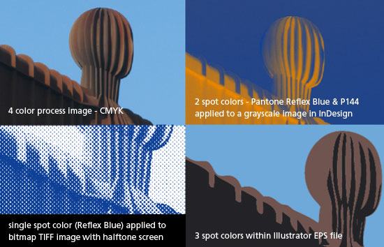
Here is an example of 4 color process printing and three examples of spot color printing. There is a lot of versatility in designing for a spot color print run - experiment and see what results you can achieve!
If the plates are aligned correctly on the press, the registration is accurate, and the result is sharp and clear. If the plates are misaligned, the registration is inaccurate, and the result is blurred and poor.
This teaches us that no matter how good the artwork that left our studio was, the project can still be messed up by a less-than-conscientious printing company. For potentially expensive print runs it is wise to press-pass the finished product, which means actually standing at the end of the press and checking the quality of the finished product as it comes out of the machine.
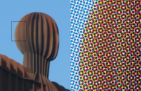
If you look at a full color magazine through a magnifier, you'll see that all the colors are made up of CMYK patterns, as shown by the above image. If you look at an area of spot color through a amgnifier, there will be no screen - it will show an area of solid, unbroken color (unless the grayscale or bitmap image it is applied to has a halftone screen of its own).
So How Does This Apply to me?
This means that the artwork you produce either has to be spot color artwork or CMYK artwork. Never, never NEVER produce RGB artwork. There is no such thing in the world of print. RGB (Red, Green, Blue) is a screen color mode and should only ever be used on screen for websites, video and other such screen based applications.
Never create final artwork destined for print with RGB images in place, or with RGB color swatches in use. It’s as simple as that. If you do, the printed result will be utterly unpredictable. Don’t let your color inkjet or laser printer fool you into thinking that if it prints out OK on them it’ll be OK for press. It won’t be.How do I create 4 color process and spot color swatches in InDesign, Illustrator or Quark?
Your layout program will have the color swatches you use defined as either CMYK 4 color process swatches or SPOT color swatches. This will also be the case in Illustrator or other vector graphic program.
4 Color Process & Spot Colors in Adobe InDesign CS2
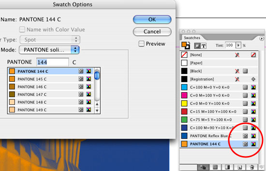
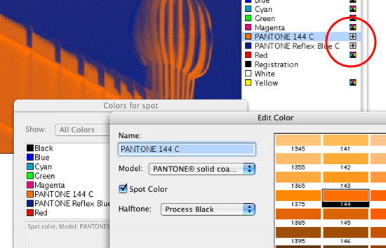
In Adobe InDesign, create a new color swatch from your color palette. From the COLOR MODE dropdown menu, select PANTONE Solid Coated. Then you just select the Pantone reference number of your choice. You'll see that the COLOR TYPE option is grayed out as SPOT. You can convert the Pantone color to 4 color process CMYK later if you wish.
When done, you can easily identify spot colors from 4 color process swatches because the little gray icon to the right of the color name has a little circle inside a box... a spot, in fact (see the screenshot below). If you double click one of the swatches you can change the attributes of the selected color.
You can apply two colors to an image in InDesign (as long as it is a monochromatic image saved as a Grayscale or Bitmap TIFF) by using both the black selection pointer tool for the background color and the white direct selection pointer tool for the image pixels. For a more detailed look at Bitmap images, click here.
4 Color Process & Spot Colors in Adobe Illustrator CS2
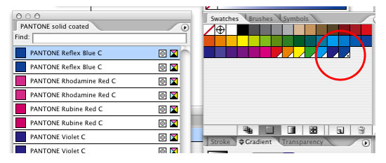
Adobe Illustrator operates in a similar way, except that to access the Pantone reference numbers you need to go to WINDOW/SWATCH LIBRARIES/PANTONE SOLID COATED. The little dot in the bottom right corner of the swatch (see image below) indicates that the color is a spot color. All other swatches are 4 color process (assuming the document was set up in CMYK color mode).
If there's just little triangle (bottom right of the square) it shows that the color has a global attribute, meaning that any changes to it will affect the color of all items which have that swatch applied.
4 Color Process & Spot Colors in Quark XPress 6
In Quark XPress, create a new color swatch by going EDIT/COLOR and clicking NEW COLOR from the dialogue box. From the MODEL dropdown menu, select PANTONE Solid Coated. Then you just select the Pantone reference number of your choice. You'll see a check box that enables you to keep the swatch as a spot color or change it to 4 color process. You can convert the Pantone color to 4 color process (CMYK) later if you wish.
You can identify spot colors from the color swatch palette because the little spot in a box, whilst the CMYK swatches retain a little quartered box containing the 4 process colors (see the screenshot below).
Again, you can apply two colors to an image in Quark (as long as it is a monochromatic image saved as a Grayscale or Bitmap TIFF). Do this by using the Item Tool for the background color and the Content Tool for the image pixels.
Resources & More Information
- Photoshop Clipping Paths
- Free Method of Converting Quark to InDesign
- 4 Color Process Printing and Spot Color Printing - What's the Difference?
- Return from Four Color Process & Spot Color Printing to Home