Typography Design - Please Don't Shout
Some things just bother me. There's no getting away from it. Things like apostrophes. Shop owners, signwriters and supermarkets all over the country seem to have formed the very nastly habit of adding an apostrophe to plural words. I shouldn't get upset about it, but I do. I must learn to move on.
Another item in my long list of irrational irritants is the incorrect use of uppercase lettering and poor typography design. There are two forms of this insidious phenominon. One presents itself as a 'shouty' e-mail or text message. The idea that writing a sentence entirely using uppercase will have the effect of making that sentence 'more important' is erroneous. The only effect it has is to come across as shouty and aggressive.
The second form of poor usage is from a typographical design perspective. Some fonts, especially handwriting fonts, are designed to be presented using a mixture of upper and lower case. The image below is a case in point.
Typography Design Double Take
Whilst ambling along one evening to my local pub for a swift livener, I realised that a few paces back I had passed a typographical horror show afixed to one of my neighbour's gates. It takes quite a bit for me to stop and retrace my steps whilst a pint of beer awaits, but I had no choice. This beauty is what I found:
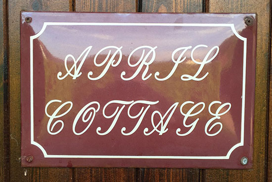
Need I say more?
I snapped a quick photo, continued on my way and tried to put it out of my mind - but the mere thought that such a sign existed wouldn't leave me in peace. I thought that posting it on Facebook might help me put the whole sorry incident behind me, but it wasn't to be. I had to fix it.
Use WhatTheFont to Identify the Typeface
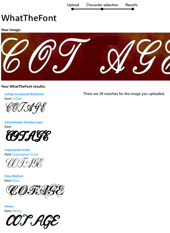
First I isolated the word 'COTTAGE' and uploaded it to WhatTheFont - my go-to font identification service. On this occasion, the results weren't quite close enough:
I then had to resort to the WhatTheFont Forum. After posting the image and requst for assistance, I got a reply within 60 seconds. No exaggeration.
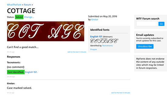
The font was identified as English 157 - close enough. It was worth the modest font fee to be able to get a peaceful night's (note the correct usage of an apostrophe) sleep.
After installing the font, I recreated the sign in Photoshop, just to get the proportions and look & feel right. I can finish it later in Illustrator. The result was more legible and less offensive:
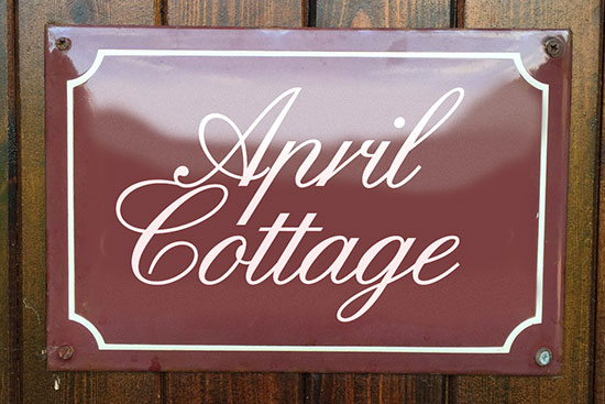
Now all I have to do is convince my neighbour to pay for a new sign. Or perhaps I'll just do it myself. Anything for a quiet life.