Which Color Mode Should Press-Ready Images be Converted to?
All images created in Photoshop are saved in a color mode. There are different types of image that are used for different types of job, and each needs to be prepared correctly for its output in print. Here we'll focus on the Photoshop modes used for press purposes. They are, in order of appearance in the Photoshop menu, accessed via Image/Mode (please note that I have only included the ones you'll use the most):
BITMAP...
GRAYSCALE
CMYK Color Mode
Other Photoshop modes are:
INDEXED COLOR... (Used for creating GIFs for website design)
DUOTONE... (Used for mixing spot color channels)
LAB COLOR (Used for color and image adjustment)
MULTICHANNEL (Used to create separated spot color plates)
I will ignore this second list for now. You probably won't use them nearly as often in your average day-to-day design-for-print activities, and you'll have plenty of time to learn about them later. Here follows a brief explanation of how we might use the main color modes, starting in reverse order with...
CMYK
CMYK - Cyan Magenta Yellow Keyline (Black)
Four color process printing involves the use of four plates: Cyan, Magenta, Yellow and Keyline (Black). Your first, natural question might be: in CMYK, why is the K black? In traditional press-preparation of color separated plates, a black keyline was used as a color indicator and as a black printed outline. Because the keyline was on the black plate, the K in CMYK represents the keyline or key plate.
The CMYK artwork which you will have supplied to a printer is separated into these four colors - one plate per color. The four CMYK inks are applied one by one to four different rollers and the paper or card (stock) is then fed through the printing press. The colors are applied to the stock one by one, gradually building up the finished product which has the appearance of being in full color. It's actually a clever optical illusion - the apparently full color result is made up of hundreds of little dots, each one either Cyan, Yellow, Magenta or Black.

If the plates are aligned correctly on the press, the registration is accurate, and the result is sharp and clear. If the plates are misaligned, the registration is inaccurate, and the result is blurred and poor.
This teaches us that no matter how good the artwork that left our studio was, the project can still go wrong. For potentially expensive print runs it is wise to press-pass the finished product, which means actually standing at the end of the press and checking the quality of the finished product as it comes out of the machine.
To cover your back (just in case there's a printing problem), you should properly 'preflight' documents before the press stage by using either the built-in tools of Quark and InDesign, or (for a more thorough job) Markzware FlightCheck for Mac (does not require native applications)..
RGB (Red Green Blue) is Not a Press-Ready Color Mode
Because RGB is not a press-ready mode, I'm going to skim over it for now.
These days, most digital images arrive on our desk (so to speak) as RGB images, unless they're specifically scanned in CMYK. There are several reasons for this: RGB images have smaller file sizes, images in RGB color mode are brighter and more vibrant on screen than images in CMYK color mode, and some programs won't open CMYK images.
BUT... don't even think about sending an RGB image to press. All images that are printed in four colour process absolutely have to be converted to CMYK.
RGB is a screen color mode, CMYK is a print color mode.
It's not just the images that have to be CMYK; all color swatches in a four color process document have to be CMYK as well (assuming there are no spot color overprint plates to be added...). See the section about process and spot color printing for more information.
Grayscale
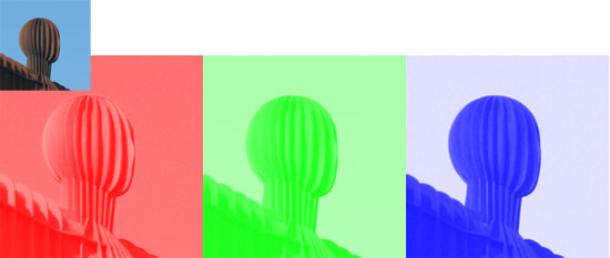
Grayscale is a single black plate. When you look at a black and white, or 'Grayscale' image, you'll see hundreds of subtle variations in shade which make up the picture. All these shades are tints of a single color - black. Although an image is output as black from Photoshop, it can have any color applied to it in a layout program, and subsequently by the printer.
The final artwork simply informs the printer what colors are supposed to be used in the printing process. If the printer is instructed to apply blue ink instead of black ink to the roller, the image will appear perfectly - in blue and shades of blue. See the section about process and spot color printing for more information.
Bitmap
Generally perceived as a less versatile alternative to vector graphic artwork, a Photoshop raster image saved in the Bitmap color mode is effectively hard-edged line art. It removes anti-aliasing from artwork, leaving a rough, jagged edge. Anti-aliasing is best explained visually, so I have included a small demonstration below. The image on the left has no anti-aliasing, which means there is no softening of the image edge. The image on the right is anti-aliased, which means that the computer has blended the hard edge by using an average of the object color and background color in order to soften the difference between the foreground and background colors.

When you create a bitmap image (not to be confused with the Windows BMP file format) you are creating a sharp, press-ready image, but with severe restrictions. It can only ever appear as single color in a document, and it has to be extremely high resolution (1200DPI, actual size) in order to appear smooth in print. If the image is lower resolution, the edge will start to appear jagged.
The Bitmap color mode is often used in the absence of a vector graphic alternative. If you've been given a single color logo on a letterhead, for example, it might be quicker for you to scan it and create a Bitmap TIFF file rather than recreate the graphic in Adobe Illustrator. Because an image converted to Bitmap color mode has no anti-aliasing, it retains a transparent background.
In order to demonstrate a bitmap in action, try the following exercise: Bitmap Image Exercise
Resources & More Information
- Photoshop Clipping Paths
- 4 Color Process Printing and Spot Color Printing - What's the Difference?
- Return from Color Mode... to Home