Press-Ready Image Tutorial: How and Why to Create High Resolution Images
When creating press-ready images and artwork, it's just as important to know why you are doing it as it is to know how.
Understanding the reason for a doing something helps you understand how to do it better. This is very true for graphic design, and especially for image preparation. Most of the work laid out in Quark XPress and InDesign is destined for the printing press. This means that the images we use need to be press-ready before anything goes to the printer. And by printer, I don't mean your inkjet or laser. As soon as the job is on the press, money is being spent. Up to the point that you create press-ready artwork, it's mostly been just your time spent on the job - not tangible ink, paper and shipping. As soon as ink touches paper, money is committed, and you'd better be very confident that the artwork on the press is perfect! No one likes a reprint - someone has to pay for it. Don't let it be your boss - or worse... you!
You can be this confident about your artwork. It just requires attention to detail and a basic checklist for the elements of your work: images, document colors, fonts and PDF settings.
If you want to skip these image basics and just find a handy reference guide, take a look at our Image Pre-Press-Checklist which'll help you prepare an image for press. And if you want the comfort of knowing that all bases have been covered before sending files to the printing house, use 'preflight' software like Flightcheck.
Let's start with image basics
In our studio, before we do any page layout work we make the images press-ready. Not so long ago it was best to use low resolution images when doing page makeup work. Only when the designs had been approved would you go through the project and replace the low res images with high res versions. There are two main reasons for this. One is that your workflow is faster if you use smaller files sizes. The second reason is that the images may need to be purchased, and you want to be sure that they have been approved before you commit funds and buy the high resolution versions.
However, computer processing speeds have increased so much now that nine times out of ten you might as well work with a high resolution, press-ready image from the beginning (assuming it doesn't need pre-purchase approval). One good reason for this is that if you're making lots of changes to a low res image, once you've been given approval by the client you'll have to redo all that work when you recreate them in a high resolution image version, and you need to make sure you recreate the image in exactly the same way. If you had worked with high res from the start, once you get approval, the job is done.
Another very good reason for using high res images from the start is this: I have lost count of the number of times a document has been sent to press containing low resolution images, saved in incorrect color modes, saved in the wrong file format. Normally this is because the document has been worked on for weeks, possibly by more than one person, and by the time it's signed off by the client, some of the placed low res images are overlooked and not substituted. Be safe! If you can, work with images which are already press-ready.
There are some exceptions to this rule. If you're buying images for the project from an image library, you'll need to get approval from the client before actually spending the money on them. This is when you should use a low res image comp for the initial proofs. Just make sure the client knows that it is just a low resolution 'positional'; you might be amazed at how many clients assume that the quality of the finished product will look just like the first low resolution proof.
What resolution should a press-ready image be?
Photographs and other images which are made up of pixels should be 300DPI, actual size. This means that if an image appearing on a page is 20cm wide, then in Photoshop the document size should read at least 20cm (or 200mm) wide and 300DPI under Image/Image Size...
Because the resolution is directly related to the physical size of the image, if you deselect 'Resample Image' and change the resolution to 72DPI, you will see the physical size increase proportionally. In print, the image would appear bigger, but be more 'blocky' because the pixels would be much larger in size.
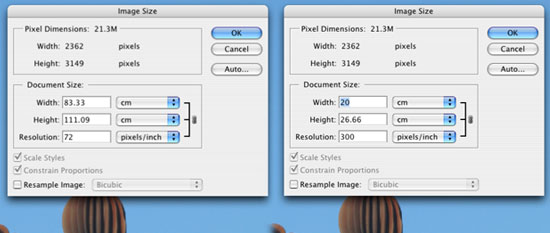
The image on the left (above) will print out at 83.33cm x 111.09cm - that's over a metre high! But the resolution will be low and therefore the image quality will be poor. The image on the right will print at 20cm wide, 300DPI; the correct press-ready resolution.
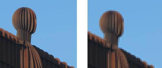
If you are producing press-ready images for large format exhibition graphics, the rules change slightly. Depending on your supplier's requirements, images can be produced at either one quarter final size at 300DPI or one half final size at 300DPI. At close quarters you can see that the finished result looks a little blocky, but from a distance it will look great - which is the idea. When you create large format graphics, it's one of the only times that the rules of press-ready image preparation need to be bent in order not to 'overcook' your computer's processor! The examples below show how a low resolution image (below right) will appear 'pixelated' when magnified to the same size as an image of a higher resolution (below left). If you squint or move away from the images they will start to look the same.
What color mode should a press-ready image be converted to?
If the image is going to be printed in full color (four color process) then the color mode should be CMYK - Cyan, Magenta, Yellow, Keyline (black). If the image will be printed in spot colors, the color mode should be either Bitmap, Greyscale, Duotone or even Multichannel... but we're just covering the basics for now, so I'll just cover Bitmap and Grayscale in more detail here.
Suffice to say that is should NOT be RGB - Red, Green, Blue! No press-ready image is ever in RGB color mode.
What physical size should a press-ready image be?
This is repetition of the resolution question above, but size and resolution are dependent upon each other when dealing with raster images. Ideally press-ready images should be placed at actual size, 300DPI. If the image is line art saved in Bitmap color mode, it should be actual size, 1200DPI.
Start with the best quality image you can lay your hands on!
I will never forget (no matter how hard I try) the gold nugget of information my old boss used to repeat on a regular basis:
“You can’t polish a turd”, he would say.
Sorry, he was right - you can't. The results are messy and no one wants to look at them. The thing is, this is one of the most valuable things you can learn about image quality. If a photograph starts off life as a 72DPI (screen resolution) image at 640 pixels by 480 pixels you will NEVER be able to transform it into a beautiful 210mm x 297mm 300DPI swan. It will always be a turd. Start with good quality, high resolution images and you will be starting on the right foot.
There is one possible exception to this rule that I can think of that I have used a few times. I sometimes have to place a client’s signature on letters destined for mailshots. Often the only copy of the signatures I get have been scanned at 300DPI, actual size (too small for Bitmap color mode images). I want to convert these into line art, so I do a bit of fancy footwork and transform them into 1200DPI ‘swans’.
This Bitmap Image Exercise explains how. It should be noted that this doesn’t always work – it works quite well on signatures because they are somewhat organic.
You now know the essentials of how and why to create a press-ready image. If you need more in-depth information, you'll find it in the links below.
Photoshop Color Settings and Color Management
The goal of this site is to give you the essential basics of graphic design workflow. I don't feel that the lack of an intimate knowledge of the intricacies of color management is a deal breaker, so I'll leave the details to others to lecture on this subject; chances are your studio will have its own preferences in this arena. I might touch on color management at a later date, but for now satisfy yourself with the knowledge that no one in your new place of graphic design employment will give you a straight answer to any color management question you throw at them! If you would like to know about color management there is some great in-depth information at computer-darkroom.com for you to peruse.
Resources & More Information
- Photoshop Clipping Paths
- Free Method of Converting Quark to InDesign
- 4 Color Process Printing and Spot Color Printing - What's the Difference?
- Return from Press Ready Image Tutorial to Home