Just What is a Bitmap?
So just what is a Bitmap? Not to be confused with the Windows BMP file format, a Photoshop image in the Bitmap color mode is an effective but a less versatile alternative to vector graphic artwork.
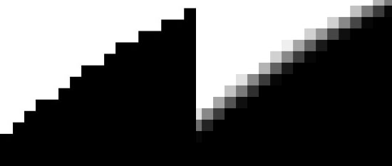
A Photoshop raster image saved in the Bitmap color mode is effectively hard-edged line art. It removes anti-aliasing from artwork, leaving a rough, jagged edge. Anti-aliasing is best explained visually, so I have included a small demonstration below. The image on the left has no anti-aliasing, which means there is no softening of the image edge. The image on the right is anti-aliased, which means that the computer has blended the hard edge by using an average of the object color and background color in order to soften the difference between the foreground and background colors.
When you create a bitmap image (not to be confused with the Windows BMP file format) you are creating a sharp, press-ready image, but with severe restrictions. It can only ever appear as single color in a document, and it has to be extremely high resolution (1200DPI, actual size) in order to appear smooth in print. If the image is lower resolution, the edge will start to appear jagged.
The Bitmap color mode is often used in the absence of a vector graphic alternative. If you've been given a single color logo on a letterhead, for example, it might be quicker for you to scan it and create a Bitmap TIFF file rather than recreate the graphic in Adobve Illustrator. Because an image converted to Bitmap color mode has no anti-aliasing, it retains a transparent background.
So just what is a Bitmap? Bitmap Image Exercise
This exercise has two purposes. One is to demonstrate a way of improving ‘organic’ text such as a signature by playing with Median and Levels in Photoshop. The other objective is to demonstrate how we might apply color to it in a layout programme such as Quark or InDesign.
First, retrieve the signature.jpg file which can be found by clicking here: so just what is a Bitmap:
Open the file in Photoshop. If you double-click the magnifying glass, the view will default to ‘Actual Pixels’ (the smoothest view available). The signature looks OK on screen, but in print this won’t do. If this is placed in Quark or InDesign as is, it will have a white background block and look fuzzy. Go to IMAGE/IMAGE SIZE and you’ll see the following dialogue box:
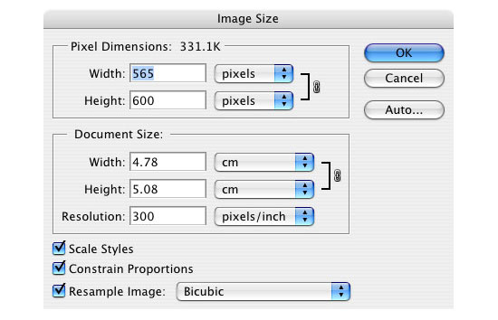
The physical size is 4.78cm x 5.08cm and the resolution is 300DPI. We want to increase this to 10sm wide at 1200DPI and then convert it to line art (as a Bitmap image). First, increase the size by typing ‘10’ into WIDTH and 1200 into RESOLUTION.
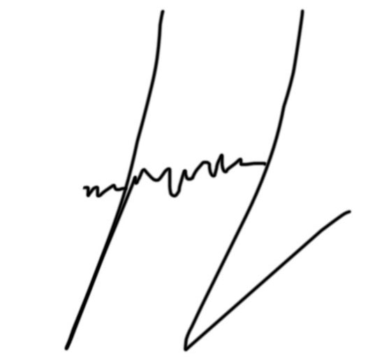
Go to Actual Pixels by double-click the magnifying glass, or by going VIEW/ACTUAL PIXELS. The image will look something like this:
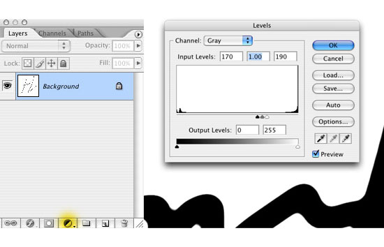
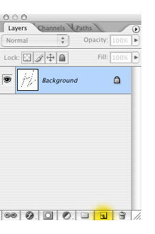
It needs some cleaning up. Go to the LAYERS palette (shown below). Click on the ADJUSTMENT LAYERS submenu (highlighted in yellow) and select LEVELS. We are using adjustment layers instead of applying the LEVELS option from IMAGE/ADJUSTMENTS/LEVELS because we want our changes to be non-destructive, which means that if we make an error, the original image will not be affected. This is generally good practice for all image retouching work. Always keep a PSD layered original as well as your ‘flattened’ finished image.
So, select LEVELS from the adjustment layers submenu. Slide the white triangle slider to the left, and the black triangle slide to the right. As you do so (assuming PREVIEW is checked) you will see the image edges become more defined.
At this stage though, the edges are still quite ‘jittery’. We need to apply a filter first. Cancel the adjustment layer.
Because the filters are ‘destructive’ we will duplicate the background layer and apply the effect to the copy, so as not to destroy the original image. Drag the background image over the ‘New Layer’ icon at the bottom of the palette to make the copy See below). Go to FILTERS/NOISE/MEDIAN. Slide the radius slider to about 10 pixels.
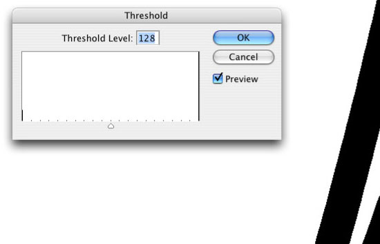
Open the LEVELS adjustment layer again and slide the white and black sliders together as shown below. As you will see, the edge is starting to look crisper and smoother. We now need to remove the anti-aliasing. You could at this stage convert the image straight to Bitmap, but there is another adjustment layer to apply in order to make the final product as good as possible. Through the Adjustment Layer submenu, select THRESHOLD. Leave it on the default value and you’ll see all anti-aliasing disappear. This is where you save your PSD layered file. Then flatten the image (LAYER/FLATTEN IMAGE).
Select IMAGE/MODE/BITMAP. Input and output resolutions should be the same (1200DPI. Click OK. Save the file as a TIFF file format. We are finished with Photoshop – now let’s see what we can do with it in Quark or InDesign.
Quark first. Create a new A4 document in Quark XPress (version 6) – FILE/NEW/PROJECT. Default should be A4 LETTER. Deselect FACING PAGES and AUTOMATIC TEXT BOX. Create two new colors. We will be working in CMYK, not Spot color, so select EDIT/colorS. Click NEW. Call the color ‘Dark Blue’. Enter the following values into the CMYK fields: C 100% M 50% Y 0% K 50%. Press OK.
Create a second new color (‘Light Green’). Use the values C 25% M 0% Y 50% K 0%.
NOTE: Look at the color wheel. When it comes to selecting complementary colors (colors which work well together), you’ll find that color opposite each other on the color wheel tend to work well together.
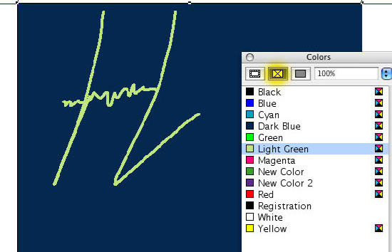
Create a large rectangle on the page using the PICTURE BOX icon in the toolbar and fill it with the Dark Blue. Select the CONTENT tool from the toolbar. Go FILE/GET PICTURE and browse to where you saved your Bitmap image. Place it. It will appear black (with no background) in the blue box.
With the rectangle and content tools still selected, show the color palette and select the middle PICTURE color icon at the top. The click Light Green and the signature will change color (see below). The preview quality shown in Quark doesn't do the final result justice - print it out and you'll see that it's lovely and crisp.
InDesign is very similar. Go FILE/NEW/DOCUMENT, select A4 from PAGE SIZE, deselect FACING PAGES and MASTER TEXT FRAME. Click OK.
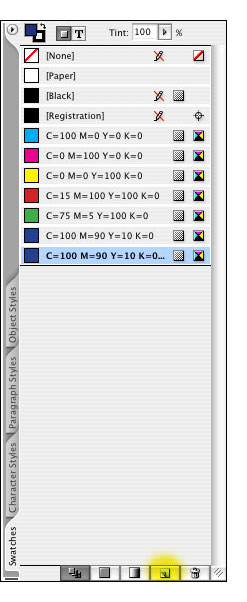
Create two new colors with the same values as above, but by selecting an existing color swatch and clicking the NEW SWATCH button at the bottom of the color Pallette. Double click the new swatch and enter the values shown above for CMYK.
Create a rectangle on the page and fill it with dark blue (remove the outline created by default). With the white pointer (DIRECT SELECTION TOOL) enabled (similar to Quark’s CONTENT tool), go FILE/PLACE, browse for the image and place it. Click the image with the DIRECT SELECTION tool to make an orange bounding box appear around the image itself, and select the Light Green swatch. The signature will change color accordingly.
Resources & More Information
- Photoshop Clipping Paths
- Free Method of Converting Quark to InDesign
- 4 Color Process Printing and Spot Color Printing - What's the Difference?
- Return from Just What is a Bitmap to Home